

What is SCCA and the Pharmacokinetics Lab?
Seattle Cancer Care Alliance (SCCA) was an organization for cancer treatment and research. The Pharmacokinetics (PK from here on out) was a specialized lab as part of SCCA.
Per SCCA's website: "The [sic] Pharmacokinetics Laboratory (PK Lab) is a CAP/CLIA-certified clinical lab that provides therapeutic drug monitoring (TDM) services. We specialize in busulfan TDM, providing individualized drug exposure targeting for patients from over 75 medical institutions in the U.S. and Canada.
Therapeutic drug monitoring (TDM) is the specialized measurement of drug concentrations for medications with a narrow therapeutic window. Drug concentrations are used to assess and adjust medication dosage to optimize therapeutic effectiveness while minimizing adverse effects."
SCCA has now been merged with Fred Hutch.

Project Goals
Understanding the needs of the Pharmacokinetics (PK) team
PK lab workers were using an inefficient and archaic system for viewing and editing patient sample data, as well as tracking their progress steps
User research will be the main focus of this project. I will observe the lab worker's daily work flows to find needs and discover pain points
Build a dashboard that improves efficiency in data entry and allows users to quickly track progress
Research phase
Focusing on observation of the PK Lab worker's daily workflows
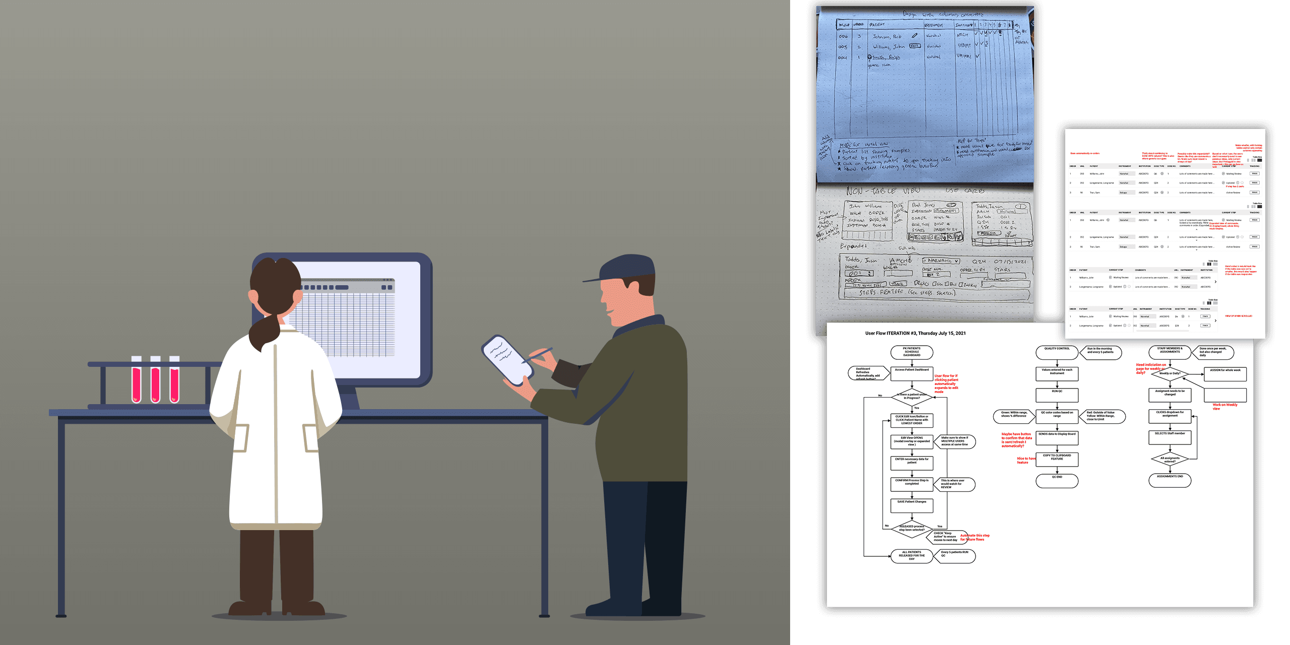
Due to patient confidentiality no pictures were allowed inside the lab. This is an artist's (me) rendition of what the observation inside the lab looked like. Also, some images from the early ideation process
Post-initial ideation, needed more info on how lab workers input patient data, how progress was tracked, and optimal display on the main dashboard and large dashboard
Observation of lab workers during a common work day was conducted. I shadowed a few lab workers inside the PK lab during their daily work tasks
A lot of focus was on after lab workers collected data from blood work, and how they entered data into the system.
Research discovered inefficiencies and redundancies in entering data into a spreadsheet and then into the system, as well a failure to easily mark and track what step of the process the lab workers were in
Ideation to Hand-off
Making design decisions based off research, testing, and hand-off to developers
Post-observation ideation
Focused on redesigning better data input forms
Designed new progress tracking feature
Designed large screen view for data display and progress tracking display
Conducted usability testing to confirm data input and progress tracking designs met needs of the lab workers

Due to patient confidentiality no pictures were allowed inside the lab. This is an artist's (me) rendition of what the observation inside the lab looked like. Also, some images from the early ideation process
Finalization & hand-off
Ensured assets met SCCA's style guide standards
Created a working prototype for interaction design demonstration
Provided thorough documentation and examples for future usability testing
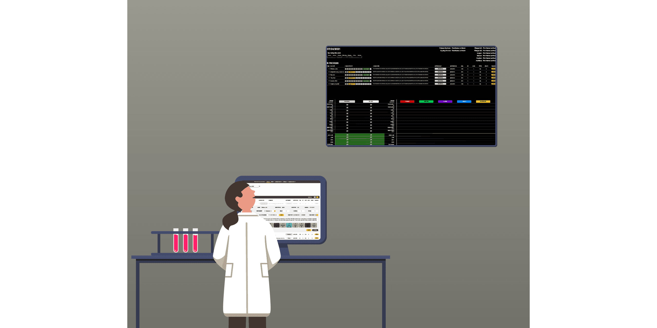
Artist (me) rendition of a lab worker entering data into the new dashboard and looking at the new display in the lab to track progress.